The original AIS logo
Modernising the Logo for Auckland Institute of Studies
I wanted to give people a look behind the process of developing a logo as customers are often surprised at the cost of logo design. I think the preconception is that designers just go away and draw some pretty pictures and they're done.
What I outline below is only modernising a logo, developing one from scratch is an even more thorough process, but it'll give you some idea.
While under the employ of Auckland Institute of Studies (AIS) we went through the process of a brand audit to gain a better understanding of what equity already existed in the brand. The process involved collecting feedback from all of AIS's stakeholders, which proved pretty revealing.
Feedback on the logo was varied but one of the recurring themes was that it was looking rather dated and didn't reflect the Institute as well as it could have. So, this was where I was tasked with bringing it into the 'modern era'.

One of the first steps I took was to flatten the design. This is a fairly modern design trend but it serves a dual purpose, as well as making it feel more modern it also simplifies the logo making it easier for reproduction.

At this point we were working with two different approaches to the branding so two versions of the logo were developed to suit each of these.

This was the 'circles' approach, I'll come back to that.

The logo still felt too busy so we lost the ribbon at this stage while also looking at colours.

We wanted to stick with the red as it is a very strong colour and has positive connotations in AIS's target markets, but the old red often caused issues when reproducing on different media. We went with a more definitive red and added the black for stonger contrast.

From here we started to look at simplifying the inner elements further. The book with all its linework could be problematic at smaller sizes.

We felt the sun rising over the book was trying to portray too much and its meaning was being lost, that was next to go.

Another approach to the book. This was abandoned with preference to the prespective version.

You may have heard the adage that sometimes you need to go back to go forward. This rings true on almost everything that a designer works on, and quite often multiple times per project. This can help reboot creativity too.

This is where we pick up the circle approach again. This is almost a blend with the blocky version. At this point I was leaning toward the blocky version of the logo but the circle approach to the branding was gaining some real traction, which meant I had to change my direction.
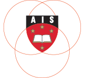
This illustrates the connection to the circles. There was a lot of indepth thinking going into the circles which was another reason why we favoured this approach for the brand, but I might save that for another post.

As you can see from the previous version; at smaller sizes the linework inside the crest was getting lost... so we lost it.
One of the glaring shortfalls of the existing logo was that there was no indication of what the business offered. So the name was to be reverted back to Auckland Institute of Studies.

Feeling like we were fairly close with the crest, we brought the words into the design. I might add that there were multiple versions of this layout, with and without the band at the top of the crest, returning to the adage of going back to go forward.
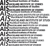
There is always a process behind finding the right typeface too. Sometimes it will require manual manipulation or extra kerning. On this occasion I think we avoided any manipulation of characters but it did need kerning adjustments.

The crest still needed to be the focal point of the logo. The font size was dialled back a bit and more balance is achieved in this version.

I recall there being multiple versions at this stage with variations of sizes and the word 'of'. You may notice the word 'institute' is slightly larger in the previous version.

At this point we again returned to the crest, choosing to round off the upper black bar to remove some of the black solids. This is an earlier abandoned concept, but you can see where concepts can split into two directions and sometimes both need to be followed through.

Note that until now we haven't utilised our final typeface in the crest. Once this is added, the roundness and extra width in the font helps fill out the bar while making the letters part of the logo.

The finalised logo. Orange replaced the gold due to reproduction inconsistency as well as helping to modernise the colour scheme. And the words 'New Zealand' were added to help recognition in the international marketplace. There were a few other steps that brought us here but I don't think they warrant an in depth explanation.
I hope this has provided some insight into the logo design process for you. As you can see it is not as simple as it might sound and all the best logos have had considerable time spent on the development process. Also note that I didn't touch on the precursory market research, nobody wants to go through all that just to find its the same as your competitor.
So if you're looking for a new logo or feel that your current logo design is looking a bit dated, Jigsaw Design can help you out. Give us a call, we've been there before.
